Designing a Logo
By Dave Middleton
Last year, we launched the Second Century Fund campaign and you may have noticed the fund has its own logo. How did the logo come about? What does it mean? Why was it designed like this? That is what this first jLab post is all about: the logo.
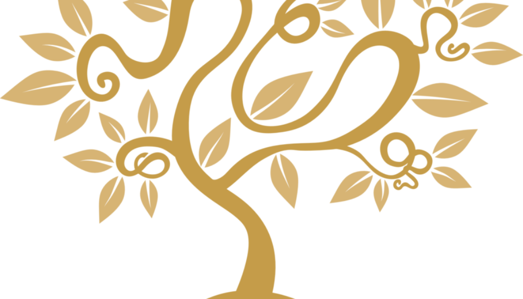
The Second Century Fund is a new fund to ensure the long-term stability and vitality of our congregation. The fund will have its own identity and is meant as a long term commitment, therefore we needed a logo we could use on all our correspondence and publications. The Board of Trustees chose an appropriate theme for Second Century Fund: “A Tree of Life”.
Forest for the Trees
The concept of a Tree of Life for a logo is certainly not new: there are numerous examples of Jewish organization logos based on this concept. The gallery below shows a random selection of logos of Jewish organizations and congregations with a tree of life logo.
A logo is a graphical representation or symbol of a organizational entity or trademark. It should be distinctive, simple, memorable, timeless, versatile and appropriate. With requirements like these, designing a logo is often not a simple task. Moreover, with so many Tree of Life logos out there how can we be distinctive?
A logo should be distinctive, simple, memorable, timeless, versatile and appropriate.
Roots in the Ark
To answer that question, we looked at the congregation logo for inspiration. Agudas Achim Congregation chose as its logo the graphics of the woodwork design on the Ark:
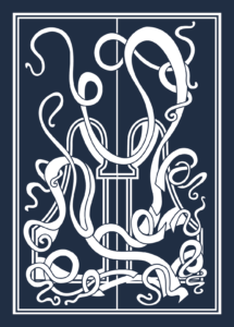
Even though the arabesque elements create a complex logo, it still has the hallmark of a logo, primarily because it is very distinctive. It did inspire us to re-use the arabesque elements of the Ark’s woodwork to create a distinctive and recognizable (memorable) design.
Colors of our dwelling
We took great care of the colors we can use for the logo. Like the color scheme we use for this website, the colors should feel familiar to you, because we took photos of leading colors in our congregation building. Marine blue derived from the chair seating, ochre from the wooden door panels, brown from the furniture and the bright blue was derived from the foyer wall painting etc. Ochre was chosen as the primary color as it resembles the color of gold which seems suitable for a Fund.

At last, for our printed publications we use typography that was derived from the foyer donation plaques. We replaced these fonts by a similar free, open source font and paired it with a very legible font to create a versatile typography set for all our printed work.
How the logo was finally built is explained in the design brief.
Design Brief
The Design Brief is a often a graphic presentation of the logo design process: how we came to create the logo and what is means. The Design Brief was presented to the Board of Trustees in September last year. Below, you can find a picture of the brief and hopefully this answers the question how we came to design the Second Century Fund logo.
More on Logo Design
The following links are recommended if you enjoy design in general and logo design (part of branding) in particular:
- ID – A Showcase of brand identities from around the world
- Rebrand – Global Brand Transformation that Motivate and Inspire
- BrandNew – Opinions on Corporate and Brand Identity Work
- Behance – Adobe’s online platform to showcase & discover creative work
And if you liked this post, please leave a comment.

